A Review of Aldi’s Online Marketing Strategy
I’m an Aldi customer. In fact, I’m their dream customer – I tell people about Aldi products all the time. I tell them about the deals I’ve received and how much money I saved. I tell them they just need to shop there once to be converted forever. I’m pretty much a marketer’s dream.
In part, it’s simply because I love a good deal. But more than that, I love businesses that are efficient, that have great products, and that find ways to make their customers feel proud to associate with them. For me there are few businesses that hit all of these points more clearly than Aldi.
I also love businesses that are smart and innovative with their online marketing – and in this area I’m sad to say that Aldi is seriously lacking. They show all the signs of trying to do everything and thus doing almost nothing particularly well – exactly what they’re not in their stores. So I’ve given myself the task of discovering how Aldi can take their marketing to a level that lives up to their brand – no easy feat.
Let’s get into it.
Email marketing review
Normally I’d start an online marketing review by looking at a website, but the core of Aldi’s strategy is email marketing. It’s the channel where they’re currently doing the best work and where they have the most potential to directly drive sales. But there’s still room for significant improvement.
So what’s their strategy? At its core, Aldi’s email marketing campaign is simple:
- Every Monday and Thursday between 5:00pm and 7:00pm Aldi sends an email to their entire database that features a selection of ‘Special Buys’, or new products that are available for only a short period of time.
- Monday’s email features products that will be in stores the coming Saturday, and Thursday’s email features products that will be in stores the following Wednesday.
- Each set of ‘Special Buys’ is broken into a theme, with at least two themes featured in each email. Generally the themes will be based on holidays, or separated so that one directly targets men (e.g. shaving products) and the other targets women (e.g. women’s workout clothing).
- The products featured will rarely be recycled within a year’s time.
This means that anyone on Aldi’s (certainly massive) email list will receive upwards of 96 emails a year, each with at least 40 new products. Those products will be in Aldi’s stores within a week of arriving in their inbox and available only for a few days. Perhaps most importantly, the deals are almost always good.
In terms of the fundamentals of an effective email marketing strategy, it’s hard to do better:
- Consistent excitement for something new.
- Built-in urgency to buy while it’s in stock.
- Great value for money.
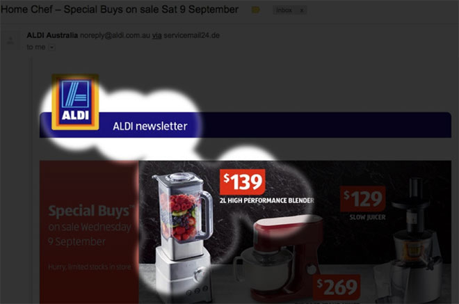
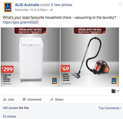
Let’s take a look at an example:
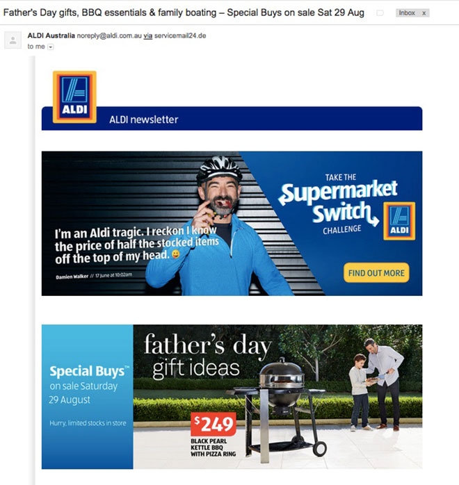
Note the strong email subject: “Father’s Day gifts, BBQ essentials & family boating – Special Buys on sale Sat 29 Aug”. Already you know if the email will be interesting to you and when the products will be available. Customers are trained to only give their time to emails that include products they might want. If the headline doesn’t appeal, they know another set of specials is coming within three or four days.
Also note how Aldi leverages holidays and special events in their offerings. They work off a defined calendar, which guides both their marketing and product offerings. And they feature products for weeks ahead of the actual event in order to provide value for all types of shoppers (people who plan ahead and those who shop at the last minute).
Aldi’s emails are also well laid out. Here’s a predictive eye tracking of another email that shows what you’ll see immediately upon opening the email:
The brand is featured well, with a product and its competitive price taking the most attention – definitely a strong first impression.
Here’s an example of how another email is perceived on mobile:
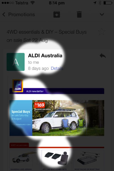
Again, the customers starts with the brand, is led to a feature product and then into the body of the email.
Opportunities for email marketing
While the fundamentals of Aldi’s email marketing campaign are very strong, it’s in the implementation where they fall short. Let’s start with the first email you receive when you sign up:
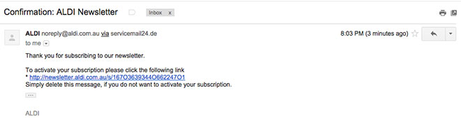
My first question is, why do people need to confirm their registration to the newsletter? They always have the opportunity to unsubscribe, so confirmation only serves to decrease the size of the email list (as invariably some people will not confirm their registration).
Beyond this though, this is the first email you receive from Aldi so it needs to show the value of signing up to the newsletter. It’s a serious oversight that the first email is the least engaging one Aldi sends to its customers.
- Where is the brand logo?
- Why not take this opportunity to further introduce the offering – whether it be Aldi overall or the Special Buys people will be receiving?
- Is there a secondary conversion that’s worthwhile for Aldi, such as sending people to their Facebook page or inviting friends to join the newsletter?
Aldi should also immediately send the latest Special Buys to all new newsletter registrations. These are people who are saying they’re eager to see some deals – and Aldi has the deals already prepared. Why make people wait two or three days to get the next set of specials when Aldi could just as easily set it up so they get an email immediately? The sooner Aldi starts delivering on the value proposition associated with the newsletter, the more likely people are to engage with it and stay engaged.
Next, let’s look at the actual products within the emails:
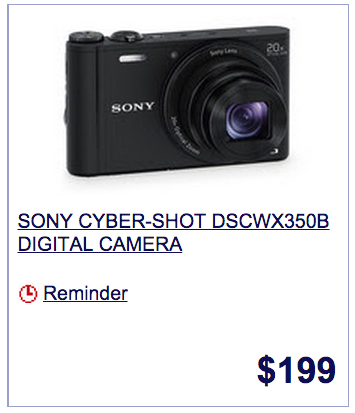
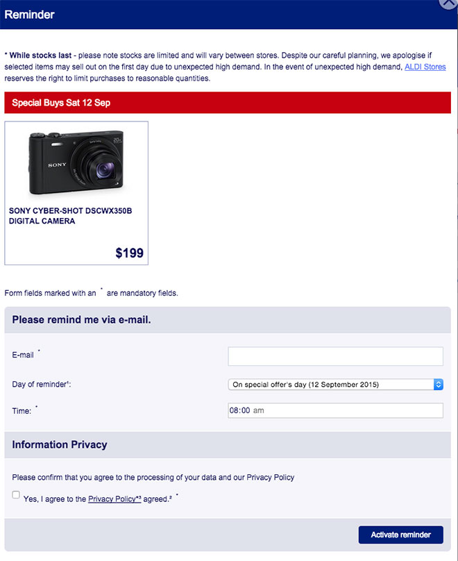
A good product shot and well-displayed price is a start – and Aldi has the right idea with the ‘Reminder’ button on the ad. Yet there are some serious shortcomings:
- First, the reminder button doesn’t work. It sends you to the product page where you have to then click on another reminder button, fill in a form and then go through a two step authentication process to activate the reminder. If I were in Aldi’s marketing team, I would immediately tell them to disable this functionality until it can be improved – right now it just makes them look bad.
- Even if it did work, when you click the button there’s no confirmation that a reminder will come.
- There’s also no secondary call to action, such as sharing the product on social media.
Instead, people are sent to a low quality product page (more on this later), and given no indication that a reminder will come. These are people specifically saying they want to buy a product, and this is Aldi’s top conversion from their email marketing campaign, given that they don’t have an e-commerce site.
Plus, if you go to the product page and then request an ‘email reminder’ through that page, you’re given this form to complete:
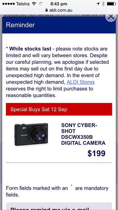
It’s even worse on mobile. Here’s what you see when you click the button:
And here’s the form you find if you realise you have to scroll down to fill it in:
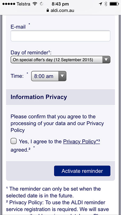
No one wants to fill out a form on a mobile phone – even if they really do want to buy the product. And since as many as two thirds of emails are opened on phones, the entire strategy should be based around mobile. With the current forms, potential customers are likely to simply say to themselves “I’ll remember” and bounce from the page. Certainly some will end up in stores but Aldi could do a lot more to ensure as many of them do as possible.
If Aldi really wants this to be an effective system, there should be no form at all. They already have your email! The whole website should have an integrated login system associated with the initial registration for the newsletter. Users should by default already be logged in, so that when they click through from their email, they can simply press one button and have a reminder set.
For high-end products, Aldi should test remarketing campaigns on Facebook and the Google Display Network, targeting anyone who has asked for a reminder. On the day the product is available, the campaign would show an ad with an image of the product and a call to action saying “Available in Stores Now”. Even if the profit margin on the individual product is small, once the customer is in the store, they’re likely to buy more. And many people won’t actually click the ad, but simply be reminded to buy when they see it.
Website review
The Aldi website is in serious need of a full redesign. Here’s their homepage:
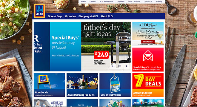
In just the first view, there are over 7 different messages that Aldi is trying to get across:
- Father’s Day Special Buys
- Aldi’s liquor store
- Sign up for the Special Buys newsletter
- Find a store
- Aldi’s products have won awards
- Aldi has low prices
- Aldi has 7 day specials
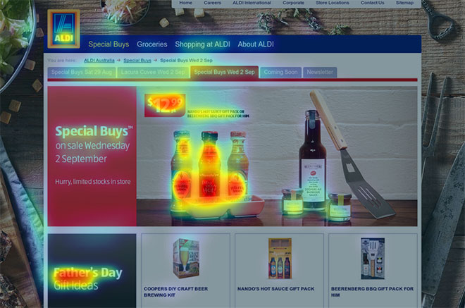
In many ways this is representative of the whole site. Aldi has not decided what its primary conversion goal is, so it’s trying to do everything simultaneously. Here’s a predictive heat map of the homepage to show what a new visitor sees in the first few moments:
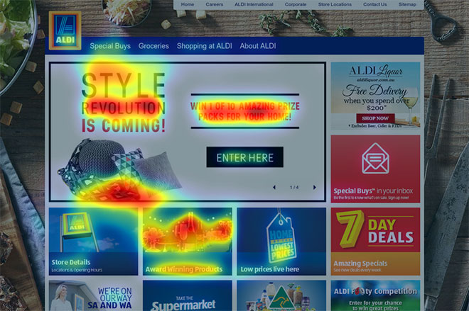
Note how the brand is basically lost. People see the main scrolling banner and one or two of the other tiles. Most people will end up on a Special Buys page featuring that particular week’s products. If those products aren’t appealing, they’ll likely bounce. Opportunity lost.
If Aldi simply picked one goal (or even two), they could use their homepage effectively to move people along a funnel towards that conversion. There’s no question that Aldi’s conversion goal should be to capture as many emails as possible. Despite its limitations, Aldi’s email marketing campaign is by far its most robust and effective marketing strategy. To further this goal, one simple update Aldi could make is to give people the opportunity to convert right on the homepage: “Get the products you want at the lowest prices around” [Sign up now].
Homepage on mobile
On mobile devices, Aldi’s homepage is more simple and engaging. Visitors see the brand and one call to action:
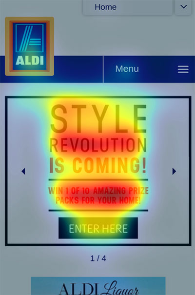
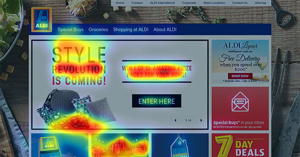
While this is more effective in terms of guiding traffic, the question remains: are these promotions worth prioritising? Here’s predictive eye tracking of the Style Revolution competition page featured above:
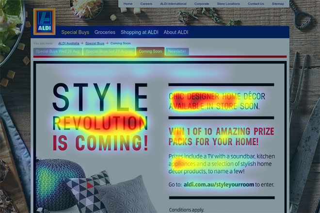
If Aldi’s goal for this page is to get people to enter their competition, that should be the primary headline, and it should be very obvious how visitors go about entering. In this case, the only way to enter is to click on the link at “go to aldi.com.au/styleyourroom to enter”. The first few times I went to this page I didn’t even realise there was a link. If that’s where Aldi wants to send people, there should be a massive button – [Enter here] – or the whole page should be clickable to send the user to the next page. Even better, it should go directly there from the homepage – why the extra step in the first place?
As a side note, the link on the page actually redirects to a different domain, https://www.aldistyleyourroom.com.au/ (which is no longer online). This is something that Aldi does with countless promotions and which they should stop immediately. If one of these promotions is really popular, gets referenced in the media or builds lots of quality backlinks, the main Aldi domain gets none of the value. Even if they redirect the site once the deal ends (which often they don’t), they still lose a lot of the value of the inbound links.
Category pages
Most of Aldi’s website is structured in a similar way to a large e-commerce website. There are a range of products organised into category pages such as ‘baby care’ and ‘gluten free’. Unfortunately Aldi does not list all of their products on their website (far from it). And the categories they do feature seem random (baby care, chocolate, olive oil, skin care).
This is a serious lost opportunity. In general, Aldi only carries one brand per item (i.e. one brand of toothpaste, one brand of tinned tomatoes, etc). So while the number of pages they would need to feature all of their products is large, it’s much more feasible than if they had a traditional supermarket model with countless brands in each product category. In terms of both user experience and SEO, this would be a big win.
It’s also important to understand how people arrive at a category page. In general there are two routes:
- Visitors click through from organic search results (Google) after searching for that category – in which case they are looking for your products.
- Visitors have navigated through the site to that category page – in which case they are both looking for your products and know your brand.
A category page has only goal: to get visitors to click on a product. The product page will make the conversion. The category page should provide only the limited information necessary for customers to choose between products, and the products that are most popular or have the highest profit margin should be listed first.
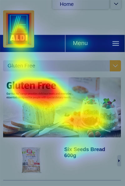
Here is predictive eye tracking of Aldi’s ‘gluten free’ category page:
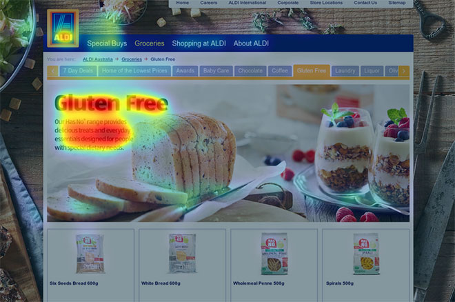
To begin with, the banner image has no calls to action and isn’t clickable. So the most valuable space on the page is not generating any engagement. If there was a single popular product featured in the banner with a [learn more] button, Aldi could effectively guide visitors through the sales funnel.
This is even more important on mobile:
In this case, users are even more likely to engage with only one product, so it better be the best. Again, visitors will expect the banner to be clickable – and slightly annoyed that it’s not.
Product pages
Aldi’s product pages are the worst part of their website design. Here’s an example:
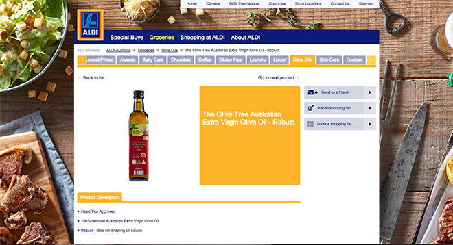
To begin with, there’s very minimal information on the product – only a picture, the product name and a few short dot points of information. There’s also no obvious next step from this page. Since it’s not possible to buy directly, the primary calls to actions are actually on the right sidebar:
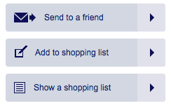
There’s a number of flaws with this design:
- The grey doesn’t stand out from the overall design.
- The buttons are small and hard to read.
- The buttons are positioned in a place where people aren’t likely to focus.
Beyond this, if you actually do attempt to convert, the site is ineffective.
Send to a Friend
Clicking the button “Send to a Friend” provides this popup:
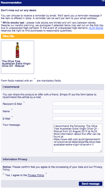
First off, I think the idea here is great – Aldi gets your email and potentially your friend’s email if they opt in. They also leverage you as a brand advocate within your personal network. But in practice, there’s a lot to be improved:
- The form should come first and be as simple as possible. Instead, the first thing you see at the top of the page are the conditions, such as ‘while stocks last’ and ‘Aldi Stores reserve the right to limit purchases’. These should be at the bottom of the form.
- The form should be built next to the product image, so while you’re filling it out you’re reminded why you’re taking the time.
- The field names should be much more clear – “Name” needs to be relabeled as “Recipient’s Name” and “E-Mail” needs to be relabeled as “Your Email”.
- Also, it should ask for the recipient’s area code or city/suburb (not as a required field) so that the message can tell the recipient exactly where the nearest Aldi store is located.
Once the form is filled out, this is the email that gets sent:
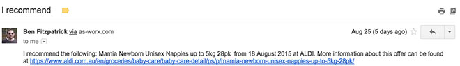
To begin with, the email subject “I recommend” tells us almost nothing about what’s inside the email and does little to encourage a high open rate. Why not “You’ll love this product at Aldi” or “Saw this product and wanted to make sure you didn’t miss out”.
In addition, since Aldi has collected the recipient’s name, the email should be personalised and begin with “Hey <recipient’s name>”.
More fundamentally though, this is an opportunity to sell someone who potentially has never been to Aldi. Even better, Aldi has had the targeting done for them, so the recipient is being sent an individual product that they’re likely to be interested in. This is a huge opportunity.
There should be an engaging email template that can fit every product, including an image, details about the product, any awards it has won, etc. It should also have information about Aldi – low prices, great products, convenient location.
Finally, Aldi should take this opportunity to try to get people to opt-in to their newsletter. Tell the recipient about the newsletter’s benefits and provide an opt-in link.
Shopping List
The other primary conversion on Aldi’s product pages is the Shopping List functionality. Basically this allows people to browse the site and add items to a list, which they can then take into the store.
Here’s an example:
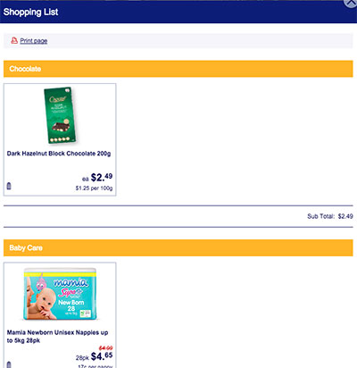
Once again, in practice this functionality is a mess. To begin with, there’s no way to register/login and thus save your Shopping List. While it does save products for a short time when you leave and return on the same device, everything is lost otherwise. In addition, the only thing you can do with the Shopping List is print it – and who prints anymore?! Who even knows how to print from a mobile phone? At a minimum, there needs to be an option to send your Shopping List to your email.
Even more fundamentally though, the Shopping List functionality is relatively useless because nowhere near all of Aldi’s products are listed on the site. A Shopping List is a great option if it allows you to organise yourself before you go into the store, but if you can only do this with a small percentage of the products, it’s ineffective.
Special Buys
Special Buys are the core of Aldi’s online offering. They’re the foundation of the email marketing strategy and one of the primary sets of pages on the site (occupying the first position in the header to the right of the logo). The Special Buys pages are updated continuously with new offers, but maintain a similar structure:
These are some of the best designed pages on the site. Attention immediately goes to the feature products in the banner, as well as the theme listed next to the first row of products. The price (which is always extremely competitive) is featured in a can’t-miss position within the banner.
There are some issues though, particularly since there’s no call to action anywhere above the fold of the page. As the main way the Special Buys are marketed is through email marketing, there should definitely be a way to sign up on this page – something like “Don’t miss any of Aldi’s incredible Special Buys – Get deals sent straight to your inbox” [Sign up now].
Further, no area in the top banner is clickable, which is particularly frustrating as it’s highlighting an individual product. People will expect to be able to click the banner and go immediately to that product page.
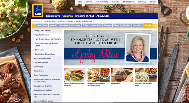
Recipes
As with all the major supermarket websites, Aldi has a strong selection of recipes, including some from celebrity chefs.
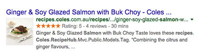
While undoubtedly a lot of time has been put into making the recipes, little thought has been put into this section of the site. The main way that recipes will drive traffic to the site is through organic search and social media. Aldi could boost the organic traffic to the recipe section immediately by implementing simple on-page code (known as schema markup) that is specific to recipes. This code helps to highlight recipes in search results in a way available to few other types of content. Here’s how Coles’ recipes (which have this markup) look in search results:
Aldi hasn’t implemented this code, so its recipes show up in search results as follows:
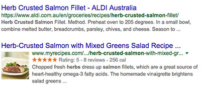
Even though Aldi ranks above MyRecipes, which of these are you likely to click? Aldi also hasn’t even included the word “recipe” in their title tag, a major oversight in terms of targeting for recipe searches.
Here’s one of their recipe pages:
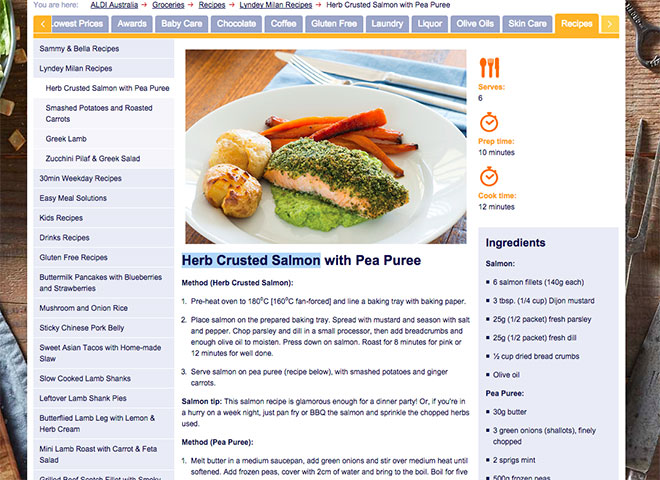
The page has some serious problems as well:
- There’s no option to email the recipe to yourself (or a friend).
- There’s no option to share the recipe on social media. With one click, you should be able to share this on Pinterest, Facebook, Instagram and other platforms.
- There’s no review functionality, which would allow people to interact more with the page and can be included in Google search results. Given how engaged Aldi customers are with the brand, there’s a lot of potential to get positive reviews and user generated tips/feedback.
Plus, if Aldi really wanted to own this space, they would link to all their products in the recipes. That way if someone wants to try a recipe, they can simply click a button to have all those products added to their Shopping List – which they can then email to themselves to review when they’re in the store.
SEO
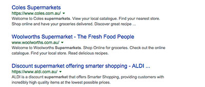
Google’s algorithm has a massive brand bias, so as a big brand, Aldi is able to get away with making a lot of mistakes when it comes to SEO. Currently Aldi ranks alongside their main competitors, Coles and Woolworths, for all of the ‘supermarket’ related keywords:
Note that Aldi should limit the length of its title tags so they don’t get cut off as they do above.
While ranking for the top target supermarket keywords is a big win, there’s tons of opportunity for broader targeting through recipes, food categories and individual products. To dominate all of these areas, Aldi needs to build up their overall domain authority to match their competition. Here’s Aldi versus Coles and Woolworths in terms of the primary SEO off-site metrics:
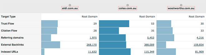
Trust flow and citation flow are fairly sophisticated metrics of the authority of a website based on the quality of other sites linking to it. Coles dominates in trust flow because of all the quality backlinks they’ve built to their massive recipe section. But Aldi has a huge opportunity to surpass Woolworths – which just happens to be the largest supermarket chain in Australia.
An area where Aldi lags significantly is in the number of referring domains (or the number of different websites that link to the site). Unfortunately, Aldi is doing little to improve in this area, as they consistently use a strategy of building websites on different domains from aldi.com.au for new products and promotions. Just a few examples are:
- http://www.aldiliquor.com.au/
- http://www.aldifooty.com.au/
- https://www.aldistyleyourroom.com.au/ (now unavailable but was a significant campaign)
- https://perfectaussiechristmas.com.au (now unavailable but was a significant campaign)
Note that aldiliquor.com.au has a significant backlink profile itself:
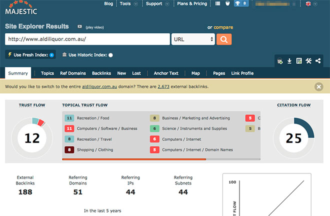
That’s 188 backlinks from 51 domains that the primary Aldi domain is not getting the full benefit of.
As a side note, Aldi Liquor is an example of a website that’s well designed for SEO and much better than aldi.com.au in terms of its conversion focus. This has helped it to quickly build strong rankings for top target keywords like ‘liquor online’ and ‘wine online’.
A more effective SEO strategy would be to have these separate websites and promotions built on subdomains of aldi.com.au – such as liquor.aldi.com.au. That way, their backlinks would help build value to the primary Aldi domain.
Another area where Aldi lags behind Coles and Woolworths is in the number of indexed URLs on the site (or the total number of pages within the website). In fact, Aldi’s site is about 1/10th the size of Coles’ and 1/8th the size of Woolworths’. Fundamental to SEO is the idea that each page on a website has a set of keywords it can target in search results. This means that Coles and Woolworths have significantly more potential keywords that can send traffic to their site.
Because Aldi is a huge brand, they can get away with not focusing on some of the more sophisticated technical SEO and link building strategies that are essential for the vast majority of online businesses. Google has for years now weighed the playing field in favour of the big brands. For Aldi though, this should not be a reason to ignore SEO as an inbound marketing channel. Instead, it’s a huge opportunity to drive tons of qualified traffic to the site, grow overall brand visibility online and increase sales in stores. And all the additions to the site that would help Aldi’s SEO campaign (such as pages for all their products and a better recipe section) would add value across their other digital marketing channels as well.
Social media
Marketing through social media is a huge opportunity for Aldi to increase brand engagement from their current customers as well as drive new business. And because so many of their customers are fiercely loyal, social media in particular is an area where Aldi can outperform their top competitors, Coles and Woolworths. Currently, at 290,000 likes on Facebook, they have about 1/3rd the following of Woolworth and Coles – roughly equivalent to their overall market share of around 10%.
One of the areas where Aldi is most effective is in their community management on Facebook. Every comment, whether positive or negative, is responded to directly and respectfully, even if they’re not related to the actual post:
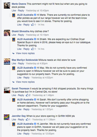
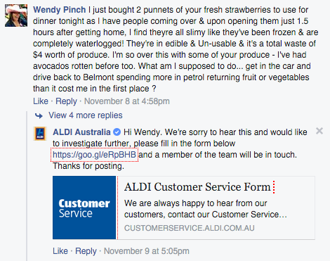
Questions are also answered knowledgeably, making it obvious that responses are coming from within Aldi’s marketing team. In addition, negative feedback is taken offline efficiently:
In terms of the actual posts, Aldi’s Facebook campaigns are relatively generic and follow a consistent framework:
- Most posts feature a Special Buy product for the week.
- Each post includes a question for followers to answer in the comments.
This strategy is effective in keeping Aldi’s loyal following engaged, though it does little to grow their Facebook audience. In fact, much of the organic fan growth is likely due to social media campaigns outside of Aldi’s control, such as Aldi Mum:
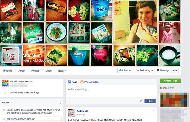
This page is an entire community of Australian mums who buy Aldi products, provide reviews, share recipes/tips and generally promote Aldi. With over 86,000 followers, this type of advertising is priceless in the social media space. If they’re not already on the case, Aldi should make sure they are doing everything possible to provide the space for these brand ambassadors to creatively promote Aldi’s products.
Beyond these fundamental social media practices, as with any marketing channel, Aldi needs to set clearly defined goals in order to be effective. And once again this is an area where Aldi falls short. Their Facebook page is a simple example of this as both of its primary conversions send visitors to the customer service form:
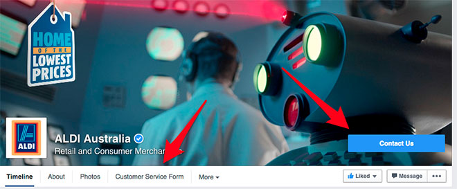
While certainly this form has value in terms of providing a place for feedback, it does little to further Aldi’s marketing objectives – and certainly doesn’t need to be featured twice. A better use of the call to action button is, once again, to get people to sign up to their newsletter through a simple email capture form. This would allow Aldi to leverage their massive social media following to grow their other channels.
Another key part of Aldi’s social media campaigns are competitions, such as Aldi Footy:
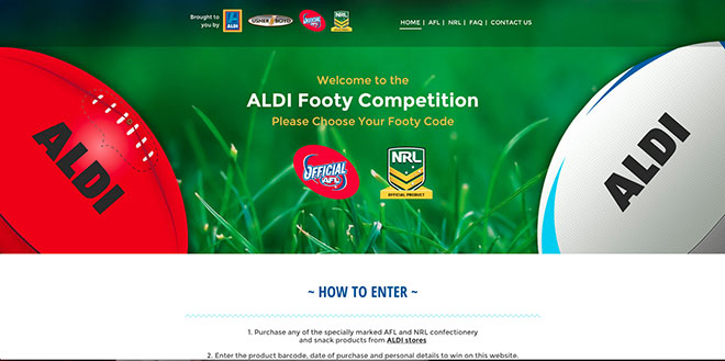
While competitions of this nature are an excellent use of social media, Aldi has overcomplicated it. Visitors who click out of Facebook first have to choose between AFL and NRL, after which they’re given the opportunity to convert on this page:
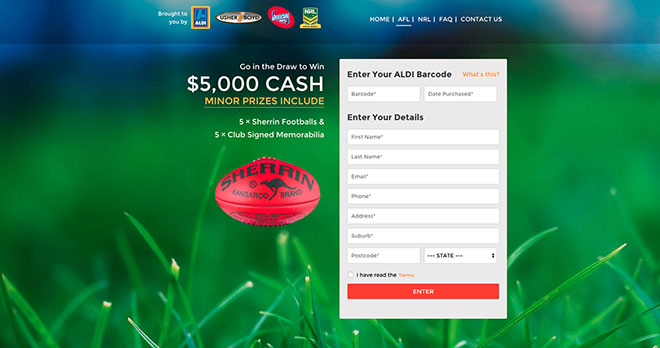
In order to successfully fill out the form, they need to enter a barcode and the date they purchased the product, as well as their name, address, phone number, etc. This means that in order to actually enter the competition, people need to physically have the product with them and be willing to provide all of their details.
If the goal of this competition was to drive sales, it’s an ineffective strategy as it requires people to:
- Land on the page and read the terms.
- Realise they need to buy the product to enter.
- Go to the store and buy the product.
- Then go back to the landing page and enter all the details.
Instead, the goal of a competition like this should be to collect email addresses of new customers that Aldi can then market to. They should keep the competition as simple as possible: use one landing page and require email only (or name and email). If they want to track location, they could ask for the person’s postcode as well. Everything else is unnecessary information for Aldi’s marketing strategies.
Beyond Aldi’s current social media campaigns, there are some significant missed opportunities. The first is the lack of structure on the website for people to easily share the Special Buys and other products they’re interested in buying. These shares are the best kind of free advertising as they involve people endorsing Aldi products directly within their networks. Share buttons could even be incorporated directly into their email marketing to drive this further.
Even more though, Aldi should be much more creative with their social media marketing, by, for example:
- Creating fun hashtags for followers to show off.
- Poking fun at Woolworths and Coles.
- Running competitions that encourage people to post photos in Aldi stores.
- Featuring short bios on different Aldi employees.
- Providing as many ways as possible for people to brag about how much money they saved at Aldi (people who really love a deal love to tell everyone – believe me, I know).
Social media could be a game changer for Aldi. With the right strategy, they could get their message out cost effectively across practically all of Australia.
Conclusion
There’s no denying Aldi’s success in Australia to date. In just 15 years, they have grown from zero presence to over 300 stores (and they actually only initially planned for 100). Central to their success is their marketing mix referred to as the four Ps:
- The right Product
- … sold at the right Price
- … in the right Place
- … using the most suitable methods of Promotion.
It’s a model that’s helped them to quickly break the Coles/Woolworths duopoly that has defined the Australian supermarket scene for decades. Yet, the competence and efficiency that defines everything Aldi does in its stores is entirely missing from their digital strategy.
It doesn’t need to be this way. They can turn their strategy around by:
- Building a new website worthy of their brand with the pages and functionality that live up to their market-leading status.
- Investing fully in their email marketing campaign and making email capture their primary online marketing goal.
- Leveraging their loyal following to engage with and promote Aldi across social media.
All of the strategies discussed in this review are likely to be successful for one reason: customers are consistently happy with their experience with Aldi and its products. This is fundamental to success in all marketing – your business has to provide value for its customers. Otherwise you’re trying to trick people. It is because Aldi has so consistently proven their value to consumers that the shortcomings in their digital marketing strategy represent such a significant opportunity.

Ben Fitzpatrick
Across the business, he is constantly working with the team to innovate and improve in order to keep Webprofits at the forefront of digital marketing.